Mumbai Metro gets a brand new logo
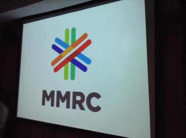
Choosing a new logo appears to be a higher priority for the MMRC these days. Last week the Mumbai Metro Rail Corporation (MMRC) unveiled a new logo that will be used on all the metro trains, stations and official documents of the MMRC.

New Logo – photo: LogoMaker, used under Creative Commons License (By 2.0)
The logo has been designed by Design Orb who took 2 months to design it. Their Director says that “the idea behind the logo are the rays of the sun. We made it as colourful as Mumbai city is and we wanted the diversity to come across through this logo. Metro train is new concept in Mumbai. Like the sun rises each day in the city, the Metro too has come to Mumbai. That is the concept behind the logo.”
The logo is said to have been finalized among the seven other logos that were proposed to the MMRC.
While this logo isn’t terribly ground breaking or original, I still like it.
– TMRG


The new MMRC logo beautifully captures the essence of Mumbai’s vibrant diversity and energy. Designed by Design Orb, the logo symbolizes the sun’s rays, representing the metro’s new dawn in the city. Though not revolutionary, its colorful and inclusive design resonates well with Mumbai’s spirit, marking a significant step forward for the MMRC.