Yet Another New Logo Revealed for Mumbai Metro
Hat tip to Rajendra B Aklekar for sharing this.
Maharashtra’s Chief Minister Devendra Fadnavis today launched yet another new logo conceptualized for Mumbai’s Metro lines which are all in different stages of implementation. This is the third logo to be released in the city in the past 3 years with Line 1 (Versova – Ghatkopar) operated by MMOPL utilizing this logo and Line 3 (Colaba – SEEPZ) utilizing the MMRCL’s logo.
This new logo will be utilized exclusively on the new lines under development by the MMRDA – example: Line 2A between Dahisar – DN Nagar and Line 7 between Dahisar East – Andheri East.
As per the Chief Minister:
The Metro Logo is in two colours – Turquoise Blue and Dark Blue. The Turquoise Blue, according to colour psychology, has a refreshing and calming effect affording a sense of relaxation and represents efficiency and innovation. The Dark Blue spells out responsibility, honesty and strong moral principles. These two clearly describe our commitment while we present various Mumbai Metro Corridors to the city and its metropolitan region
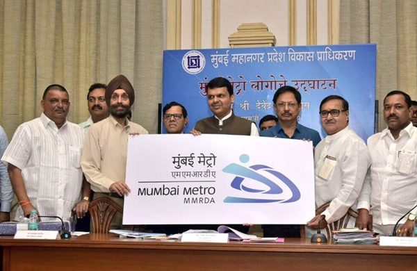
Photo Copyright: CMO Maharashtra

Source: MMRDA
Pardon my lack of imagination, but is it supposed to represent a side-on look of an aerodynamic high speed rail train?
For more updates, check out the Mumbai section of the The Metro Rail Guy!
– TMRG


Do checkout my blog on MUMBAI METRO: https://thecoreengineers.blogspot.com/2019/12/mumbaimetro.html
And Do Share Your Thoughts